Logictics Landing Page Design
Logictics Landing Page Design
Logictics Landing Page Design
Logictics Landing Page Design
Logictics Landing Page Design
Overview
Overview
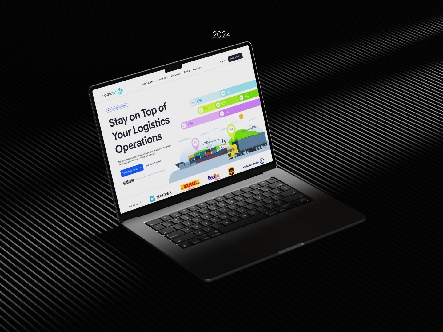
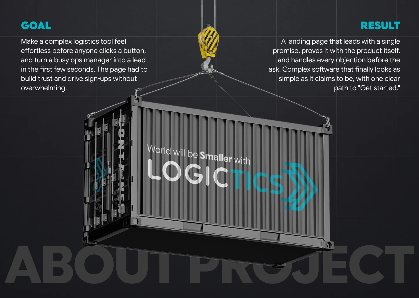
Logictics is a logistics SaaS I designed for Kanar INC, a major importer and manufacturer whose operations had outgrown spreadsheets. After building the product and brand, it needed a front door, a landing page that could sell something hard to explain: control over a complex operation, in just a few seconds.
Logictics is a logistics SaaS I designed for Kanar INC, a major importer and manufacturer whose operations had outgrown spreadsheets. After building the product and brand, it needed a front door, a landing page that could sell something hard to explain: control over a complex operation, in just a few seconds.
Story
Story
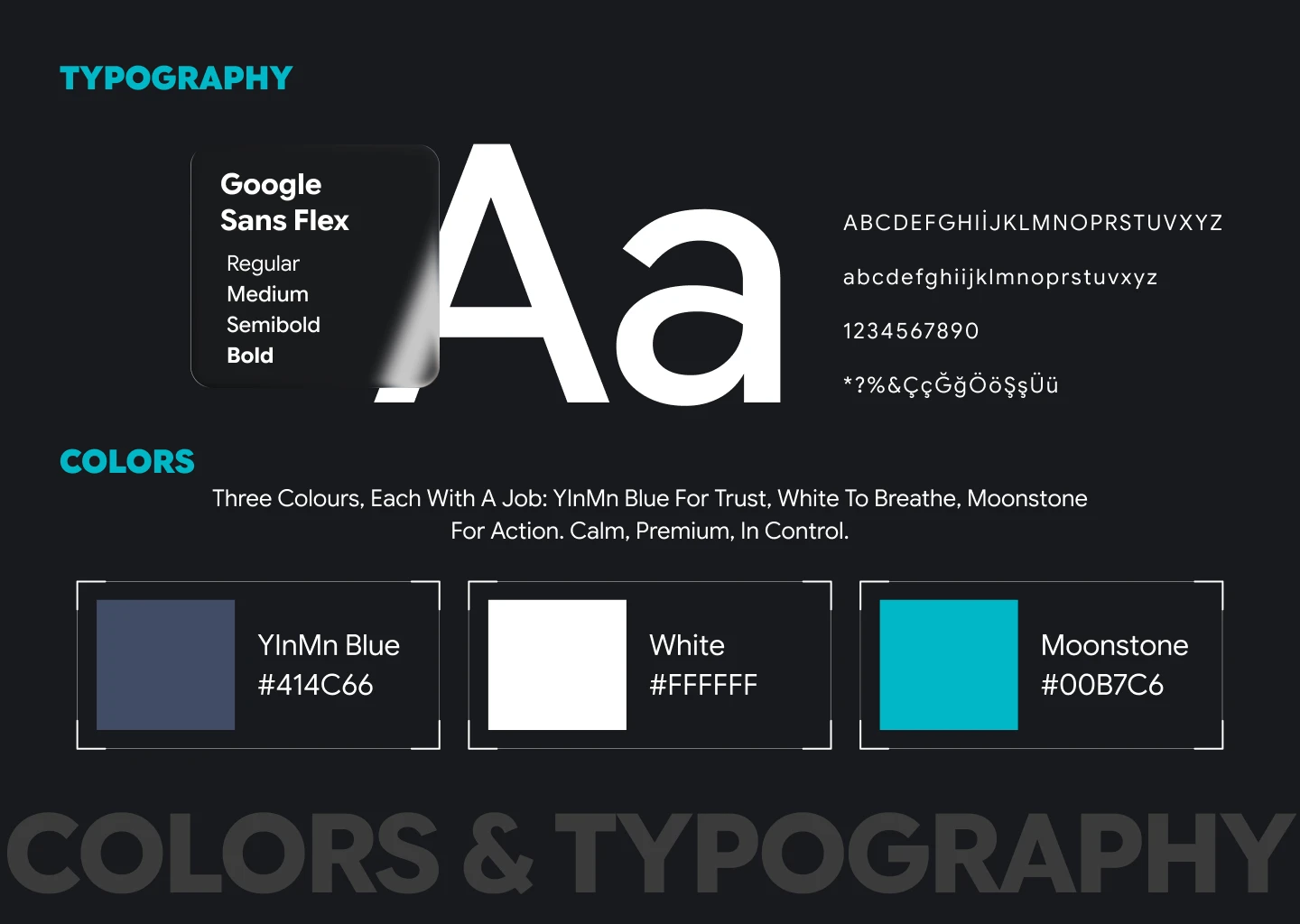
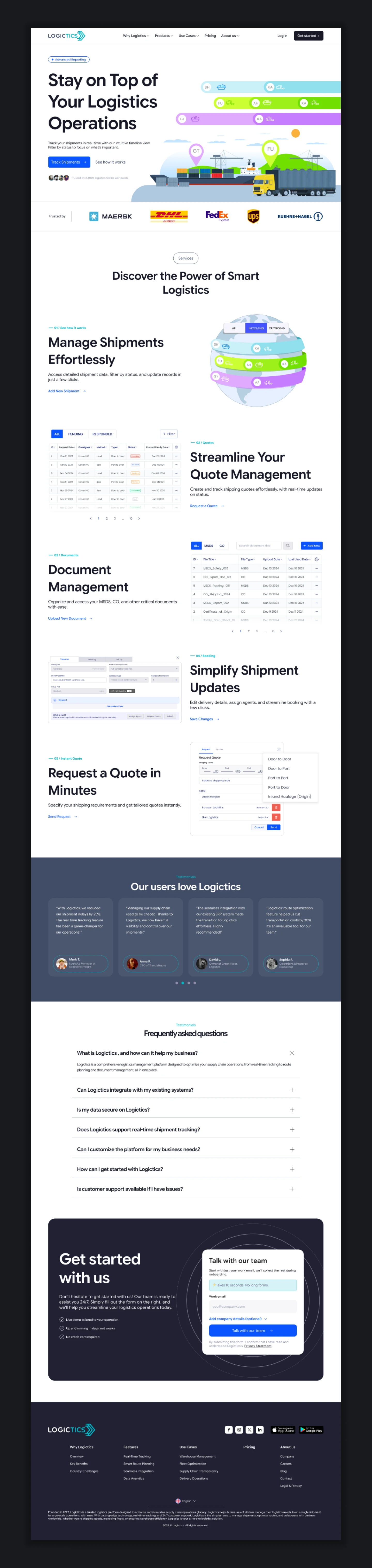
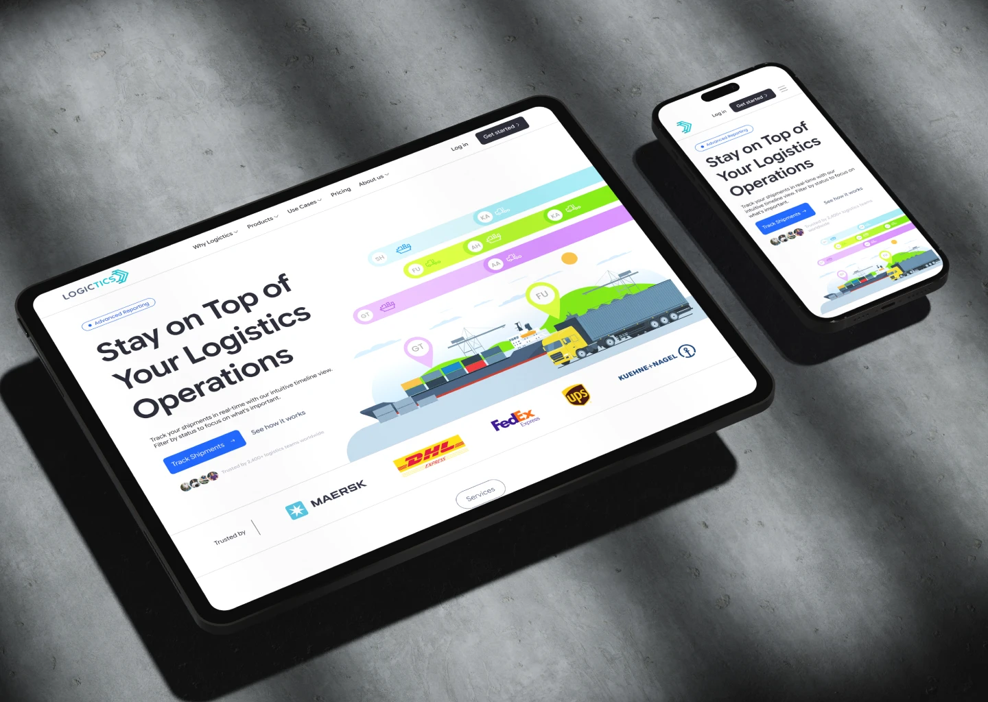
A landing page for complex software has one impossible job: explain enough to build trust, but not so much that you scare people off. So I stopped asking "what features do we list?" and started asking "what should someone feel in the first five seconds?" The answer was control. Every decision served that. The hero shows a live shipment timeline instead of describing real-time tracking. Each feature section answers one question with real UI mockups instead of abstract icons. Carrier logos, testimonials, and an FAQ handle every objection before the visitor reaches the form. One typeface carries every word from a dense data table to a full-width headline. Three colors, each with a job. The result is a page that leads with one promise, proves it with the product, removes every objection, and asks for just one thing.
A landing page for complex software has one impossible job: explain enough to build trust, but not so much that you scare people off. So I stopped asking "what features do we list?" and started asking "what should someone feel in the first five seconds?" The answer was control. Every decision served that. The hero shows a live shipment timeline instead of describing real-time tracking. Each feature section answers one question with real UI mockups instead of abstract icons. Carrier logos, testimonials, and an FAQ handle every objection before the visitor reaches the form. One typeface carries every word from a dense data table to a full-width headline. Three colors, each with a job. The result is a page that leads with one promise, proves it with the product, removes every objection, and asks for just one thing.
Client
Client
Kanar INC
Kanar INC
Industry
Industry
Logistics
Logistics
Duration
Duration
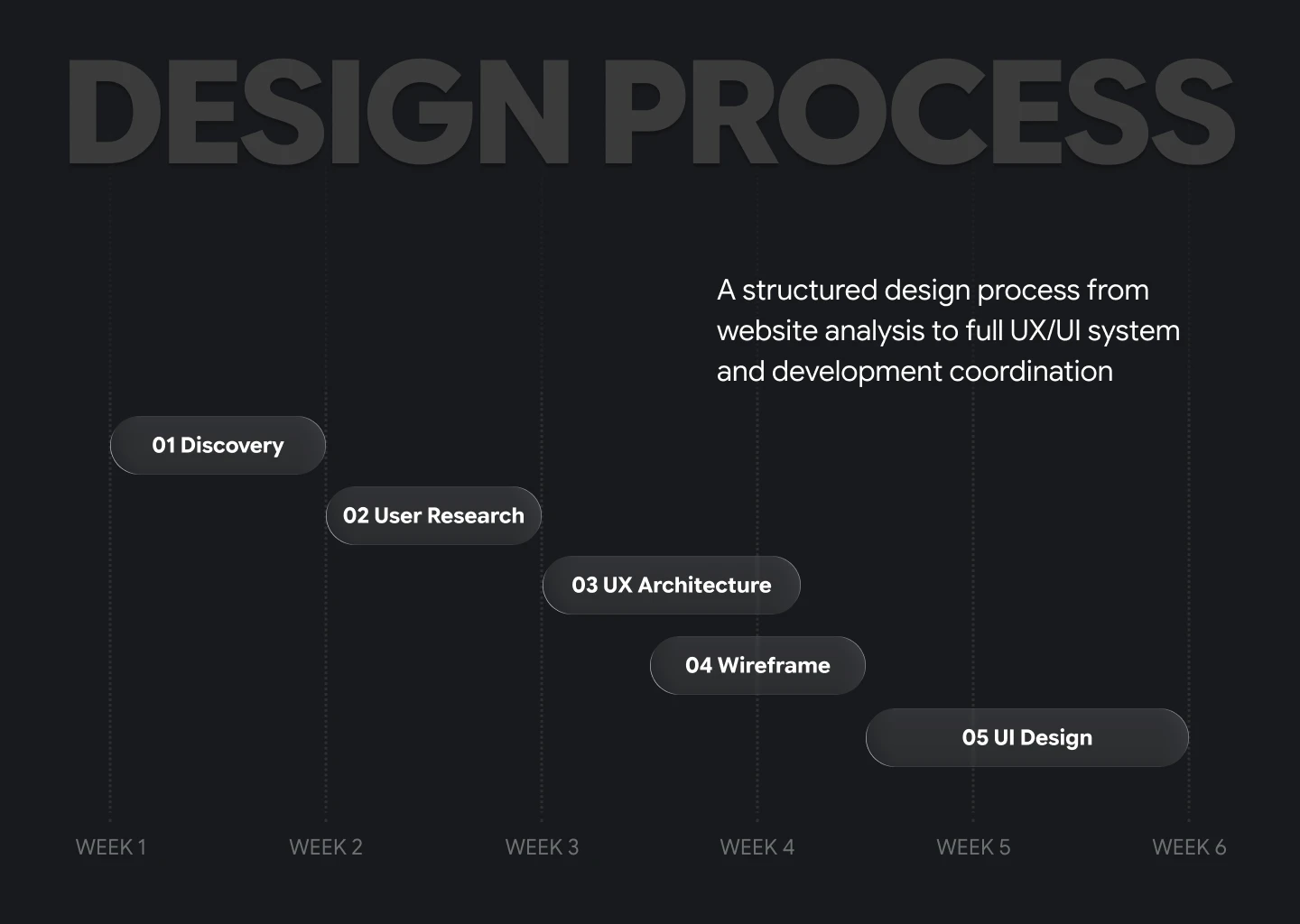
6 Weeks
6 Weeks
Year
Year
2024
2024
Website Design
Let’s
Talk
Ready to transform your vision into reality? Let's discuss how powerful design can elevate your project. Click here to start our collaboration and make magic happen together!

1 Spot Available
Let’s
Talk
Ready to transform your vision into reality? Let's discuss how powerful design can elevate your project. Click here to start our collaboration and make magic happen together!
1 Spot Available
Let’s
Talk
Ready to transform your vision into reality? Let's discuss how powerful design can elevate your project. Click here to start our collaboration and make magic happen together!
1 Spot Available
Let’s
Talk
Ready to transform your vision into reality? Let's discuss how powerful design can elevate your project. Click here to start our collaboration and make magic happen together!
1 Spot Available
Let’s
Talk
Ready to transform your vision into reality? Let's discuss how powerful design can elevate your project. Click here to start our collaboration and make magic happen together!
1 Spot Available