Yage Collections UI/UX & Development
Yage Collections UI/UX & Development
Yage Collections UI/UX & Development
Yage Collections UI/UX & Development
Yage Collections UI/UX & Development

Overview
Overview
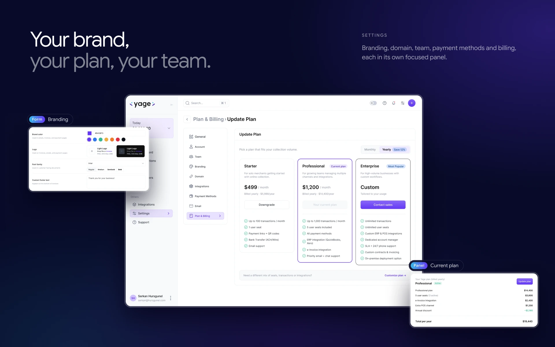
Yage is a software company building tools for how small businesses run their money. Its collections platform does one job: helping merchants get paid. I led the product end to end, from user research and brand to UI design. I also built the front end myself. The result is one dashboard where every account, every payment link and every currency lives in the same place.
Yage is a software company building tools for how small businesses run their money. Its collections platform does one job: helping merchants get paid. I led the product end to end, from user research and brand to UI design. I also built the front end myself. The result is one dashboard where every account, every payment link and every currency lives in the same place.
Story
Story
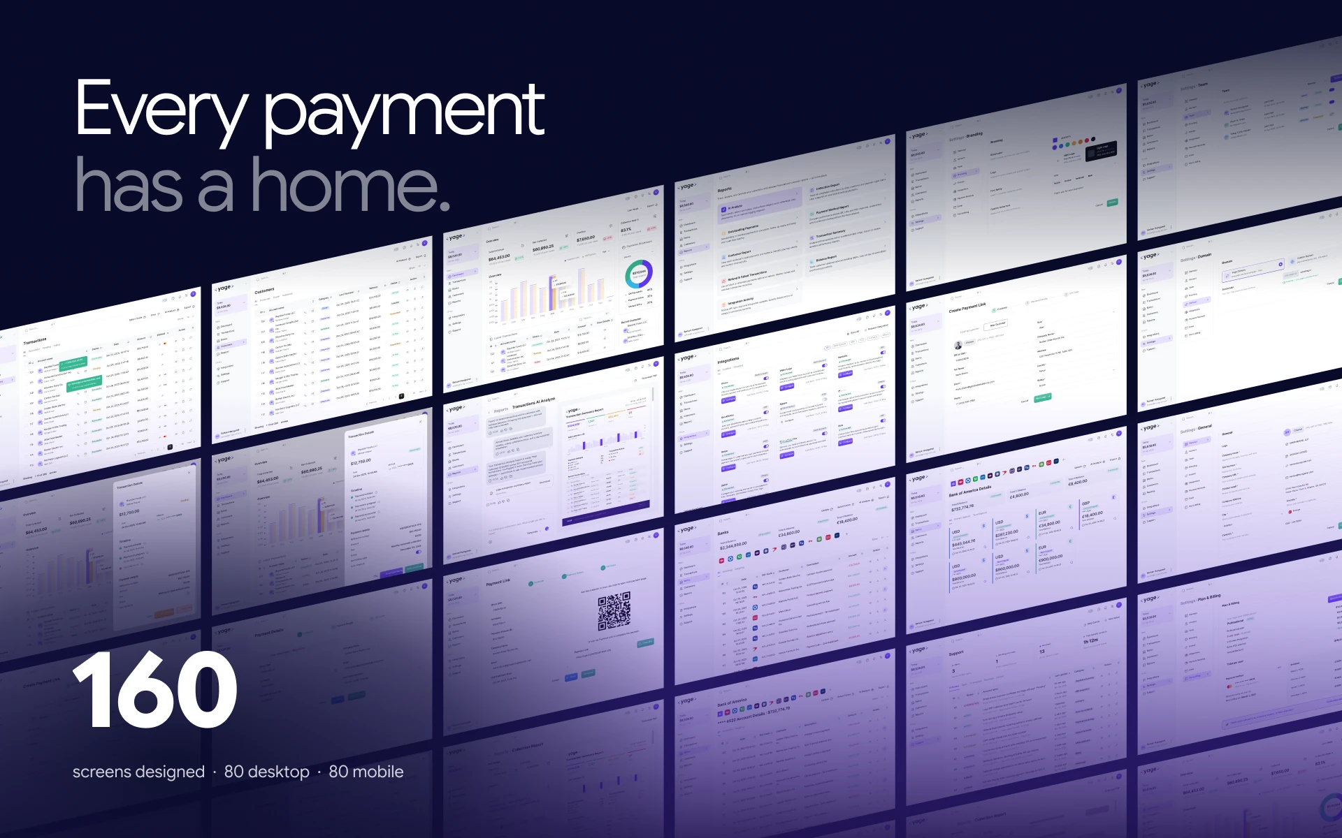
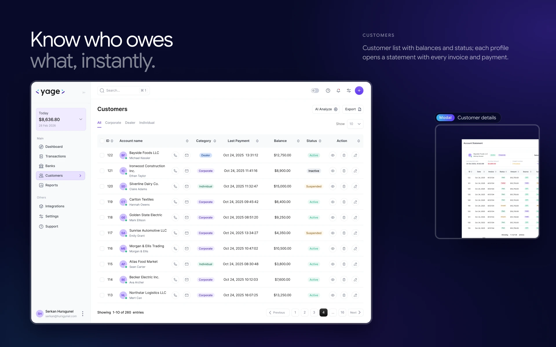
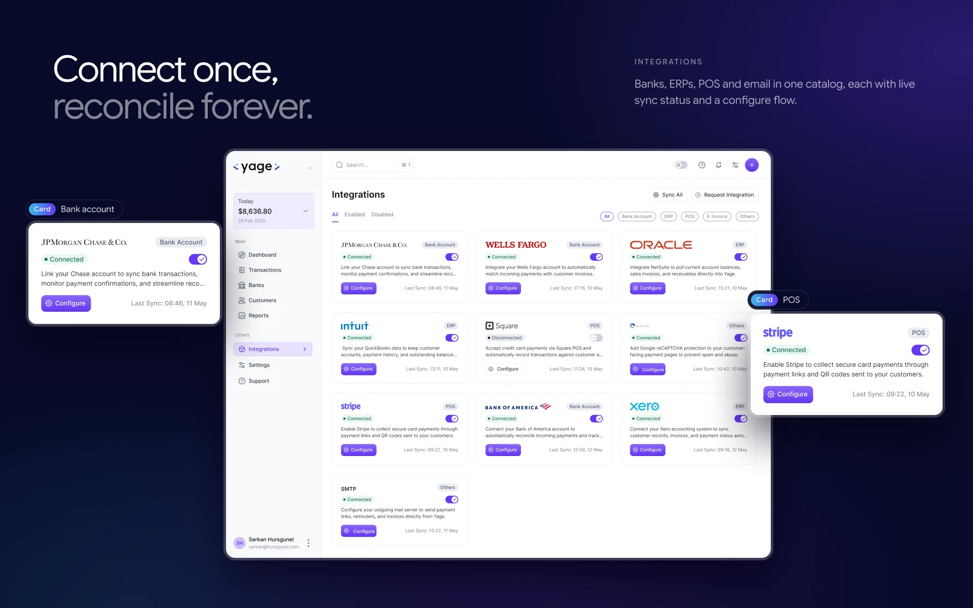
We started by sitting with merchants to see how they actually get paid. Thirty interviews with owners and finance teams showed the same pattern. 68% were still reconciling bank accounts by hand every week. 81% said their customers hesitated to pay through unbranded links. 47% lost hours every month to multi-currency reconciliation. Payments weren’t the problem. Everything around them was. That set the direction. Instead of another payment tool, Yage became a hub built around the moment money comes in. We mapped every step from sign-in to a paid QR link and cut it down to four steps, with nothing more than two clicks deep. The brand had to earn trust at the exact point where a customer decides to pay, so the payment link carries the merchant’s own identity rather than looking like a third-party form. The interface grew from that one idea. One screen shows the whole day: collected, net, overdue and collection rate. Every transaction opens its full record in a side drawer. USD, GBP and EUR accounts sit side by side, matched to the customers who paid into them. Reports assemble themselves into PDF-ready summaries. Integrations connect banks, ERPs and POS systems once and keep them in sync. Support tickets live next to the payment they’re about, so nobody has to leave the app to fix a problem. Every flow was designed twice. The mobile app keeps the same hub, the same QR moment and the same ledger, sized for one thumb. In total that’s 160 screens, 80 for desktop and 80 for mobile. I then took the design into code and built the front end of the dashboard and landing page myself, so what shipped matches what was designed.
We started by sitting with merchants to see how they actually get paid. Thirty interviews with owners and finance teams showed the same pattern. 68% were still reconciling bank accounts by hand every week. 81% said their customers hesitated to pay through unbranded links. 47% lost hours every month to multi-currency reconciliation. Payments weren’t the problem. Everything around them was. That set the direction. Instead of another payment tool, Yage became a hub built around the moment money comes in. We mapped every step from sign-in to a paid QR link and cut it down to four steps, with nothing more than two clicks deep. The brand had to earn trust at the exact point where a customer decides to pay, so the payment link carries the merchant’s own identity rather than looking like a third-party form. The interface grew from that one idea. One screen shows the whole day: collected, net, overdue and collection rate. Every transaction opens its full record in a side drawer. USD, GBP and EUR accounts sit side by side, matched to the customers who paid into them. Reports assemble themselves into PDF-ready summaries. Integrations connect banks, ERPs and POS systems once and keep them in sync. Support tickets live next to the payment they’re about, so nobody has to leave the app to fix a problem. Every flow was designed twice. The mobile app keeps the same hub, the same QR moment and the same ledger, sized for one thumb. In total that’s 160 screens, 80 for desktop and 80 for mobile. I then took the design into code and built the front end of the dashboard and landing page myself, so what shipped matches what was designed.
Client
Client
Yage Software
Yage Software
Industry
Industry
Fintech / SaaS
Fintech / SaaS
Duration
Duration
6 Weeks
6 Weeks
Year
Year
2026
2026







Web/Mobile apps
Let’s

Talk
Ready to transform your vision into reality? Let's discuss how powerful design can elevate your project. Click here to start our collaboration and make magic happen together!

1 Spot Available
Let’s
Talk
Ready to transform your vision into reality? Let's discuss how powerful design can elevate your project. Click here to start our collaboration and make magic happen together!
1 Spot Available
Let’s
Talk
Ready to transform your vision into reality? Let's discuss how powerful design can elevate your project. Click here to start our collaboration and make magic happen together!
1 Spot Available
Let’s
Talk
Ready to transform your vision into reality? Let's discuss how powerful design can elevate your project. Click here to start our collaboration and make magic happen together!
1 Spot Available
Let’s
Talk
Ready to transform your vision into reality? Let's discuss how powerful design can elevate your project. Click here to start our collaboration and make magic happen together!
1 Spot Available