Ceya Logo & Visual Identity
Ceya Logo & Visual Identity
Ceya Logo & Visual Identity
Overview
Overview
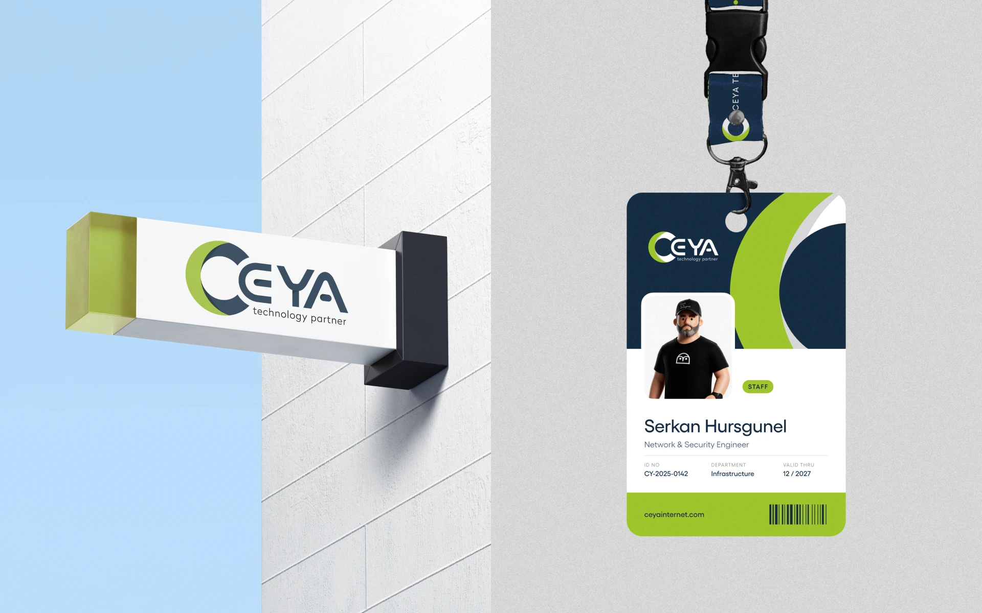
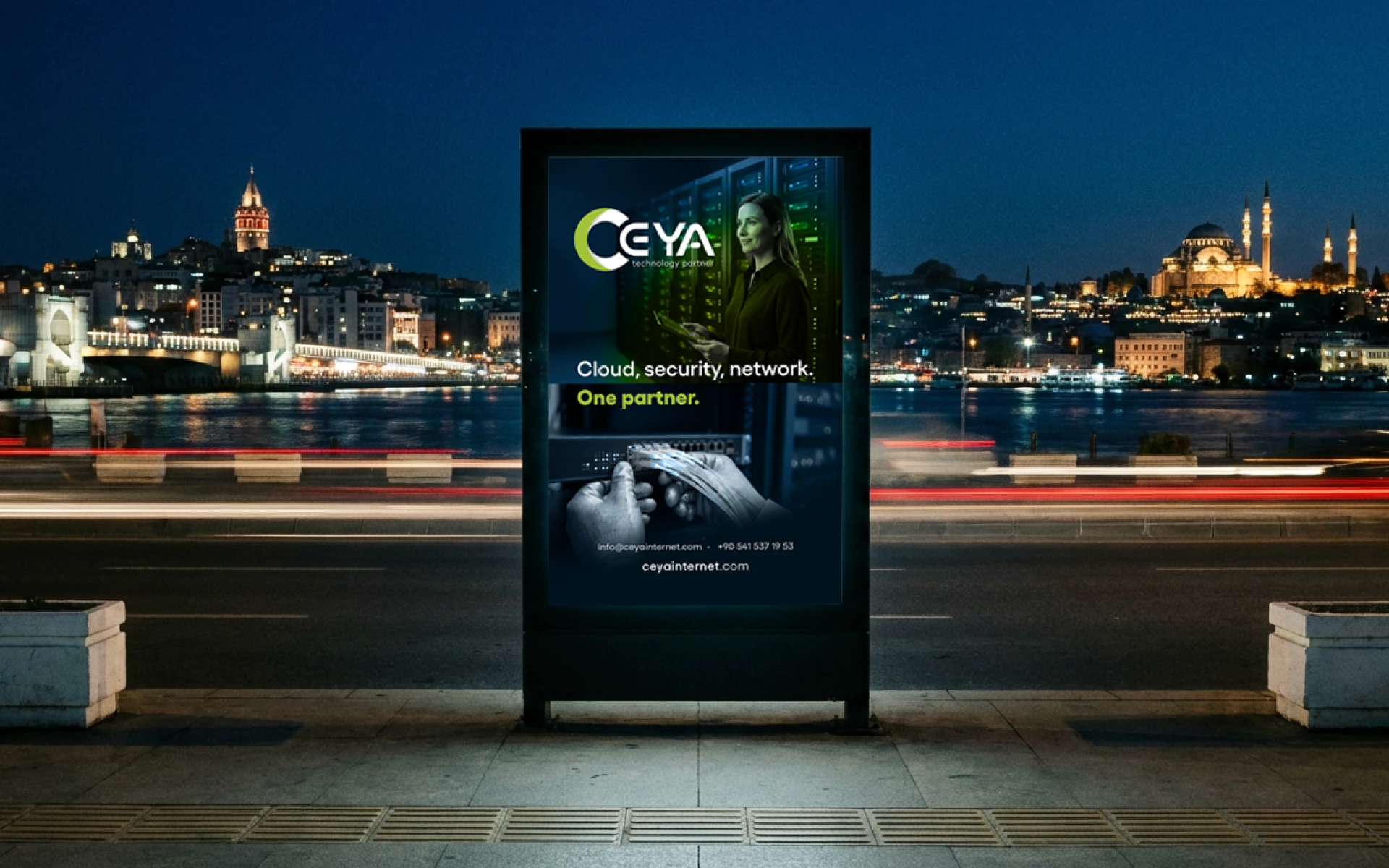
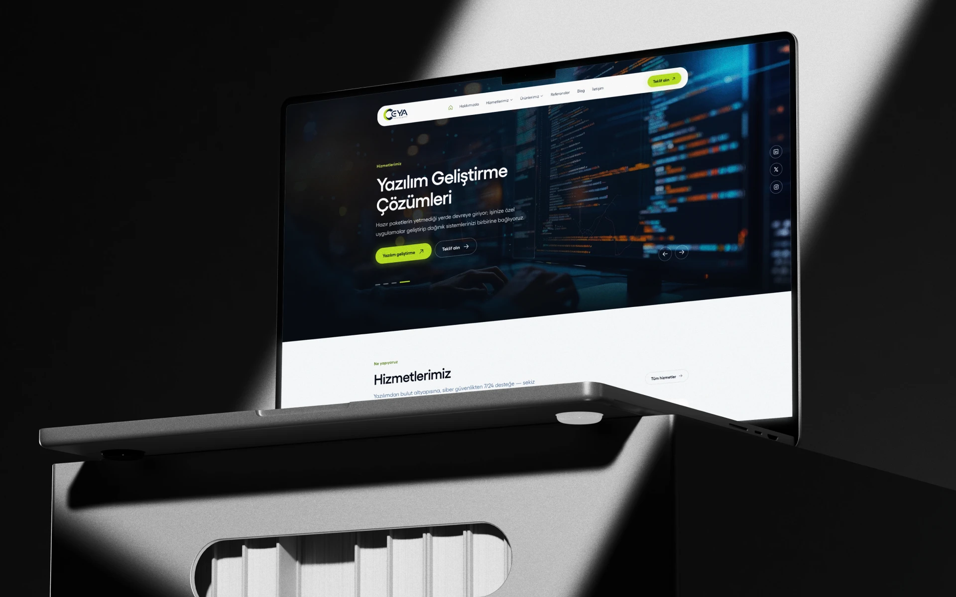
Ceya Technology is an Istanbul-based IT partner that has managed cloud, cybersecurity and network infrastructure for businesses since 2014. I redesigned their logo and built a complete visual identity around it: construction grid, color palette, typography, app icon, social media templates, signage, merchandise, ID cards, outdoor advertising and the website.
Ceya Technology is an Istanbul-based IT partner that has managed cloud, cybersecurity and network infrastructure for businesses since 2014. I redesigned their logo and built a complete visual identity around it: construction grid, color palette, typography, app icon, social media templates, signage, merchandise, ID cards, outdoor advertising and the website.
Brief
Brief
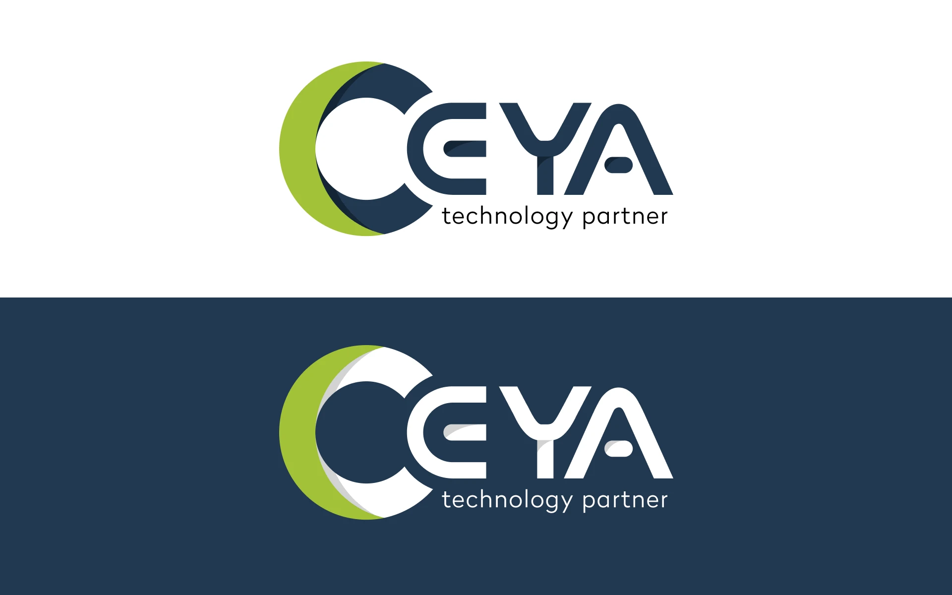
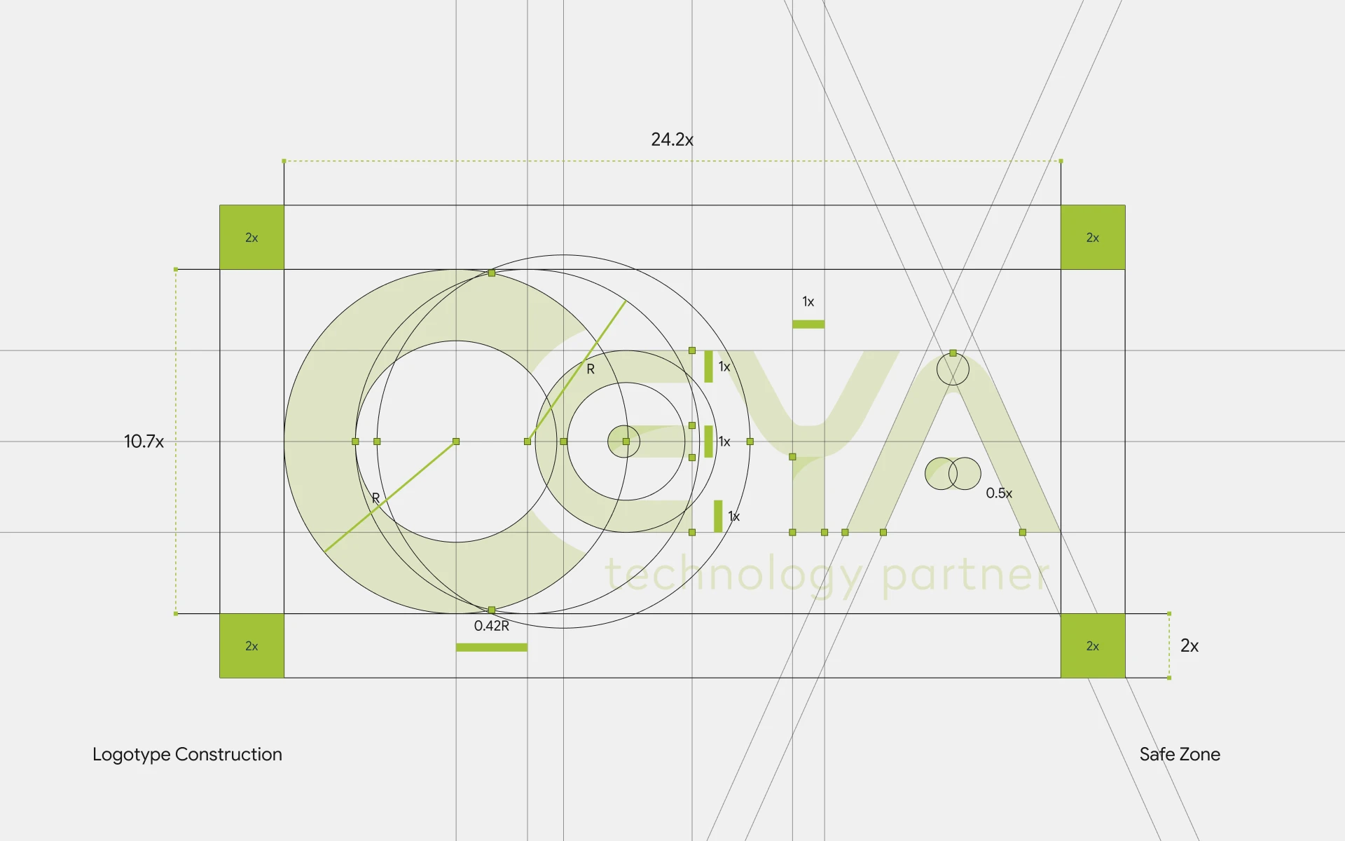
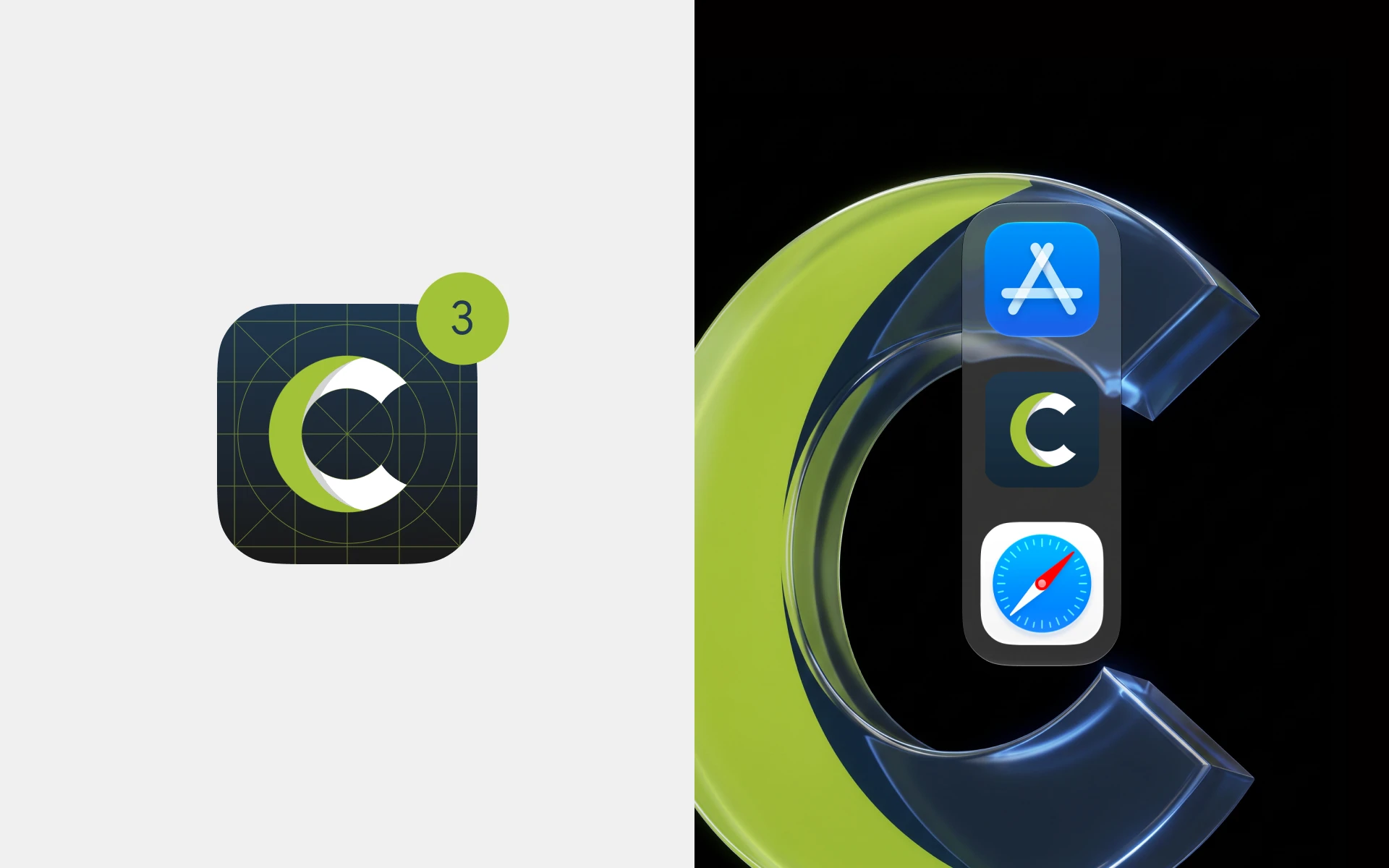
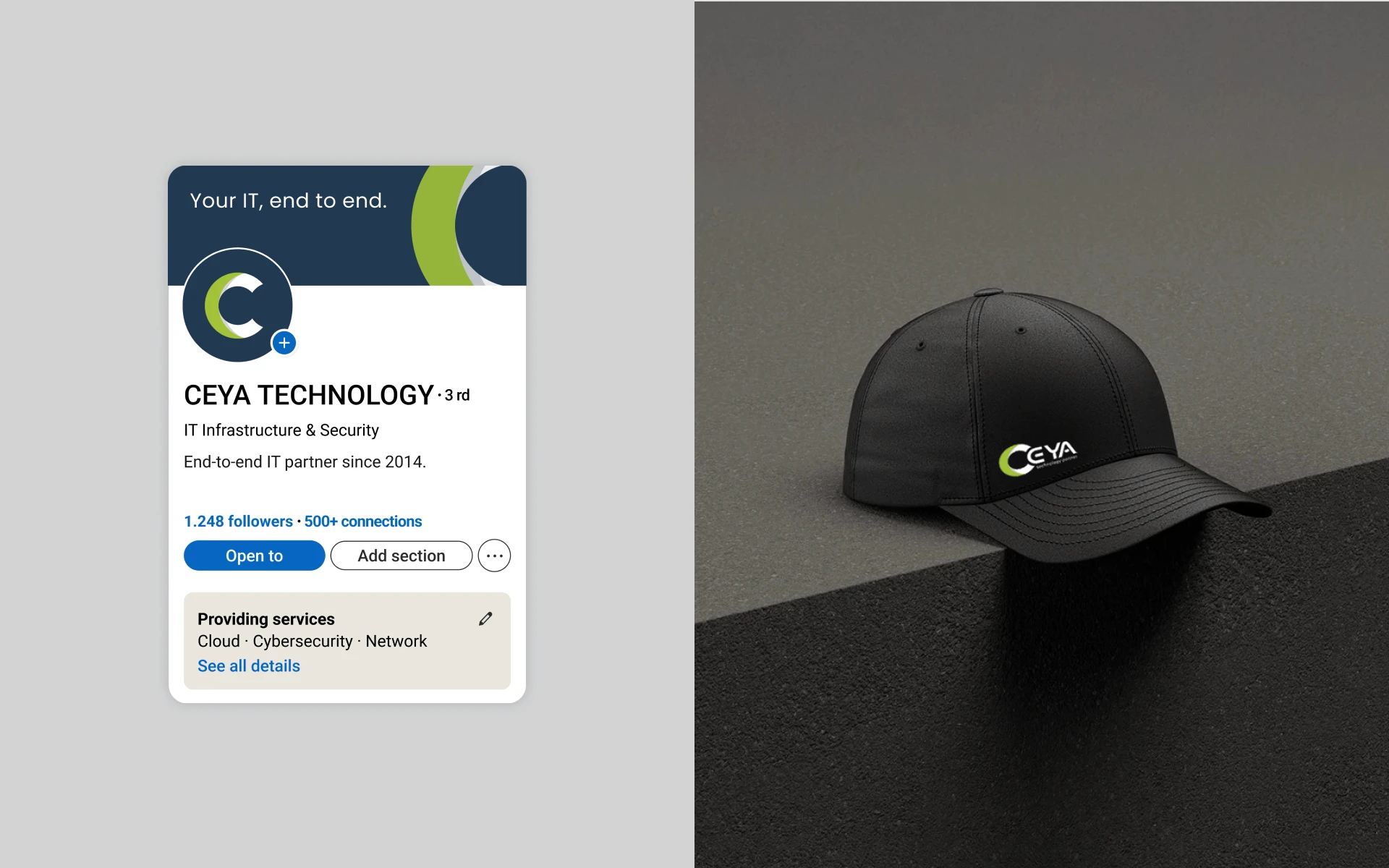
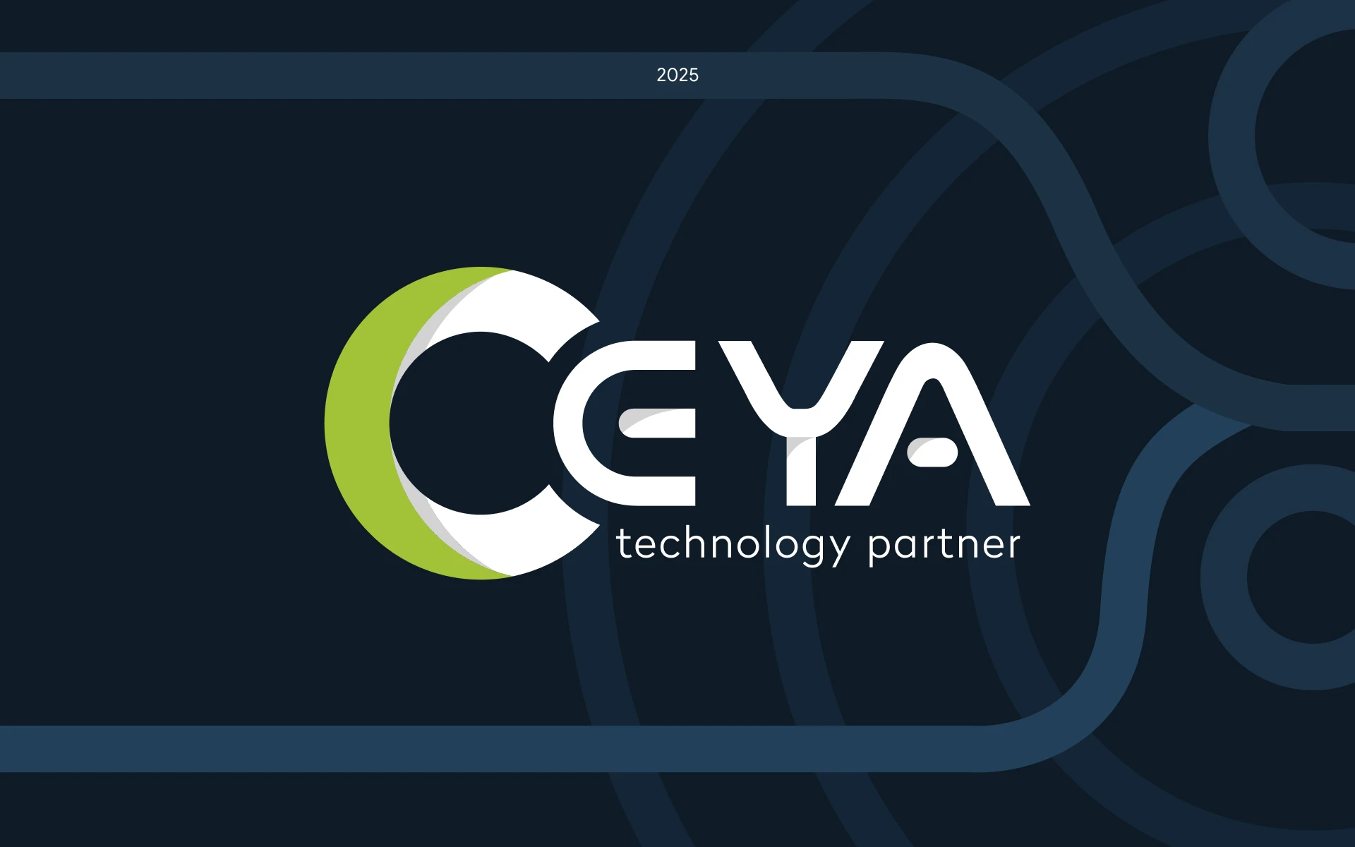
Ceya had grown from a small internet provider into a full-service technology partner, but its logo hadn't kept up. The goal was a visual identity that looks like a company you'd trust with your entire IT infrastructure. The logo starts with a single idea: a partner that's always alongside you. The mark is built from two circles of equal radius, offset by 0.42R. The green crescent sits just behind the navy C, like a shadow that never leaves. One reads as the client, the other as Ceya, always one step behind and ready to support. The wordmark comes from the same geometry. The E is drawn from the circle of the C, every stroke shares a single 1x unit, and the rounded terminals echo the curve of the crescent. The logo holds up everywhere, from a 16px favicon to a 10-meter billboard. The palette pairs Ceya Navy, a color of reliability, with Ceya Green, a signal of energy and uptime, supported by Deep Navy, Silver and Carbon. Gellix gives the system a modern, geometric voice. From there, the visual identity rolls out across every touchpoint: app icons, Instagram templates, LinkedIn, branded caps, office signage, staff ID cards and lanyards, a billboard on the Istanbul shoreline, and the new website.
Ceya had grown from a small internet provider into a full-service technology partner, but its logo hadn't kept up. The goal was a visual identity that looks like a company you'd trust with your entire IT infrastructure. The logo starts with a single idea: a partner that's always alongside you. The mark is built from two circles of equal radius, offset by 0.42R. The green crescent sits just behind the navy C, like a shadow that never leaves. One reads as the client, the other as Ceya, always one step behind and ready to support. The wordmark comes from the same geometry. The E is drawn from the circle of the C, every stroke shares a single 1x unit, and the rounded terminals echo the curve of the crescent. The logo holds up everywhere, from a 16px favicon to a 10-meter billboard. The palette pairs Ceya Navy, a color of reliability, with Ceya Green, a signal of energy and uptime, supported by Deep Navy, Silver and Carbon. Gellix gives the system a modern, geometric voice. From there, the visual identity rolls out across every touchpoint: app icons, Instagram templates, LinkedIn, branded caps, office signage, staff ID cards and lanyards, a billboard on the Istanbul shoreline, and the new website.
Client
Client
Ceya Technology
Industry
Industry
IT Services
Duration
Duration
3 Weeks
Year
Year
2025
Logo
Logo
Brand identity
Brand identity