Bilsoft Brand Identity Redesign
Bilsoft Brand Identity Redesign
Bilsoft Brand Identity Redesign
Bilsoft Brand Identity Redesign
Bilsoft Brand Identity Redesign

Overview
Overview
Bilsoft has been building accounting software for Turkish businesses for over 20 years, and more than 100,000 companies run their daily operations on it. I rebuilt the brand from the ground up so it finally reflects the company behind it: experienced, dependable and easy to work with.
Bilsoft has been building accounting software for Turkish businesses for over 20 years, and more than 100,000 companies run their daily operations on it. I rebuilt the brand from the ground up so it finally reflects the company behind it: experienced, dependable and easy to work with.
Story
Story
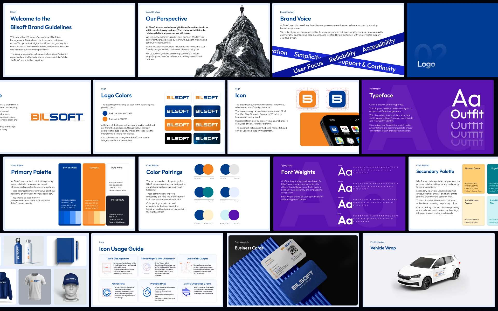
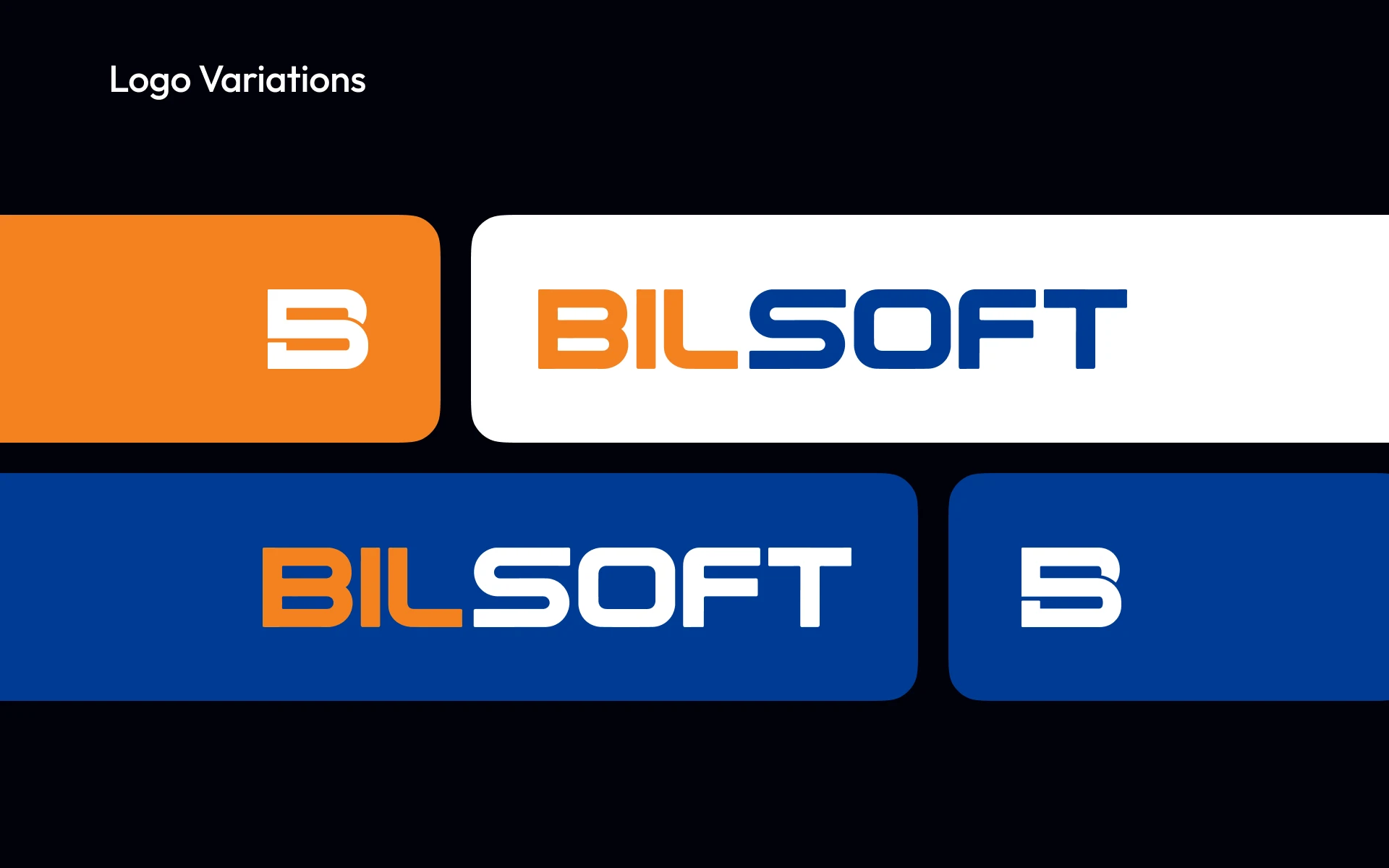
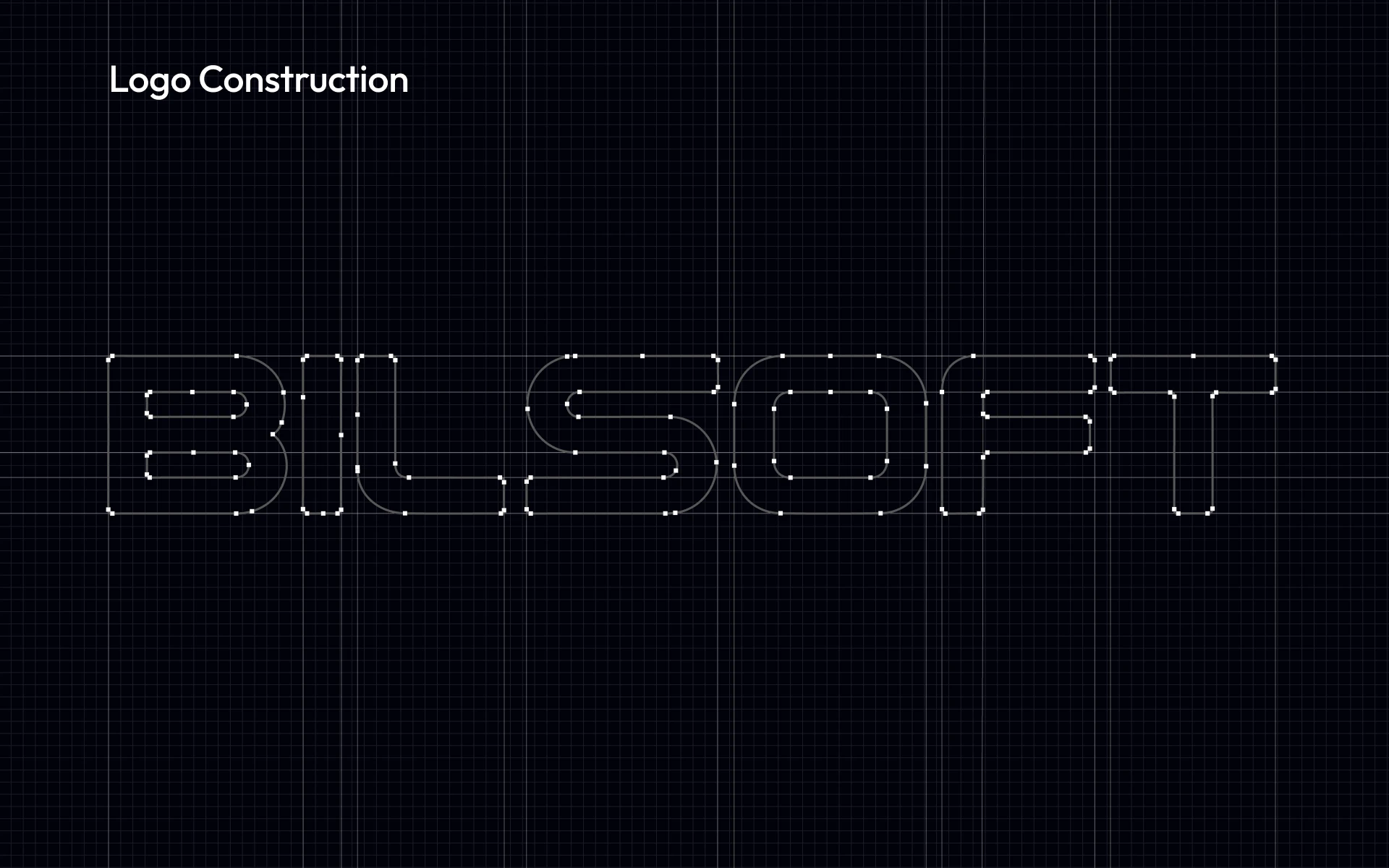
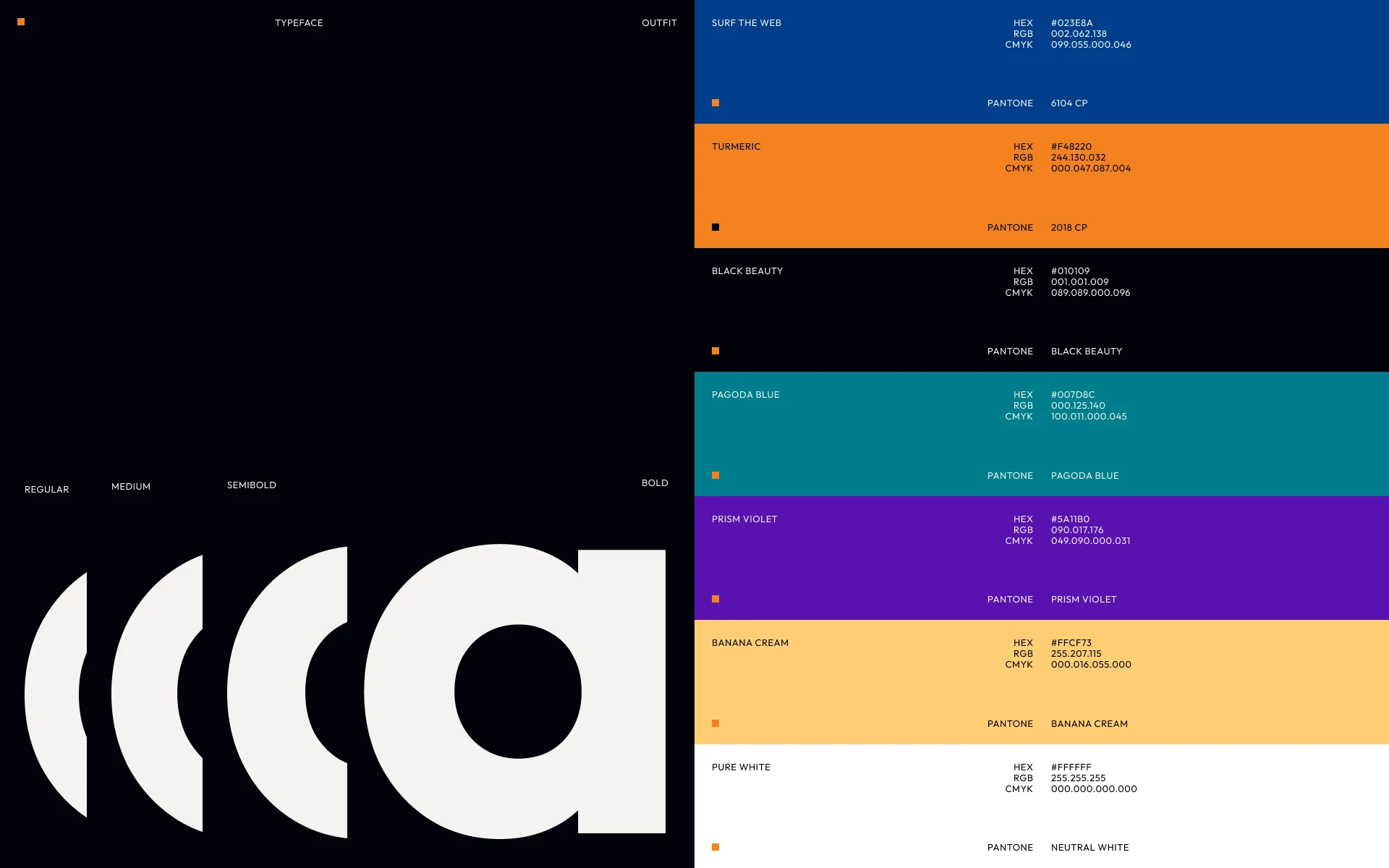
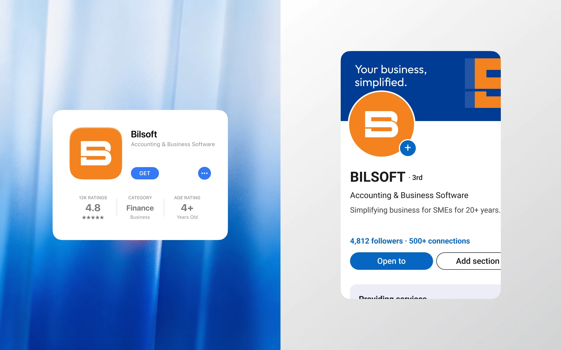
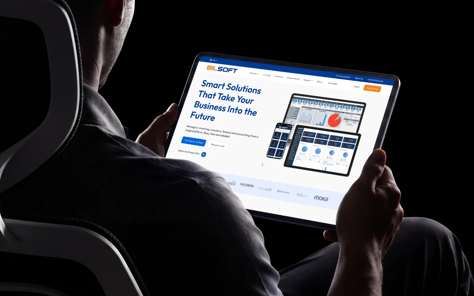
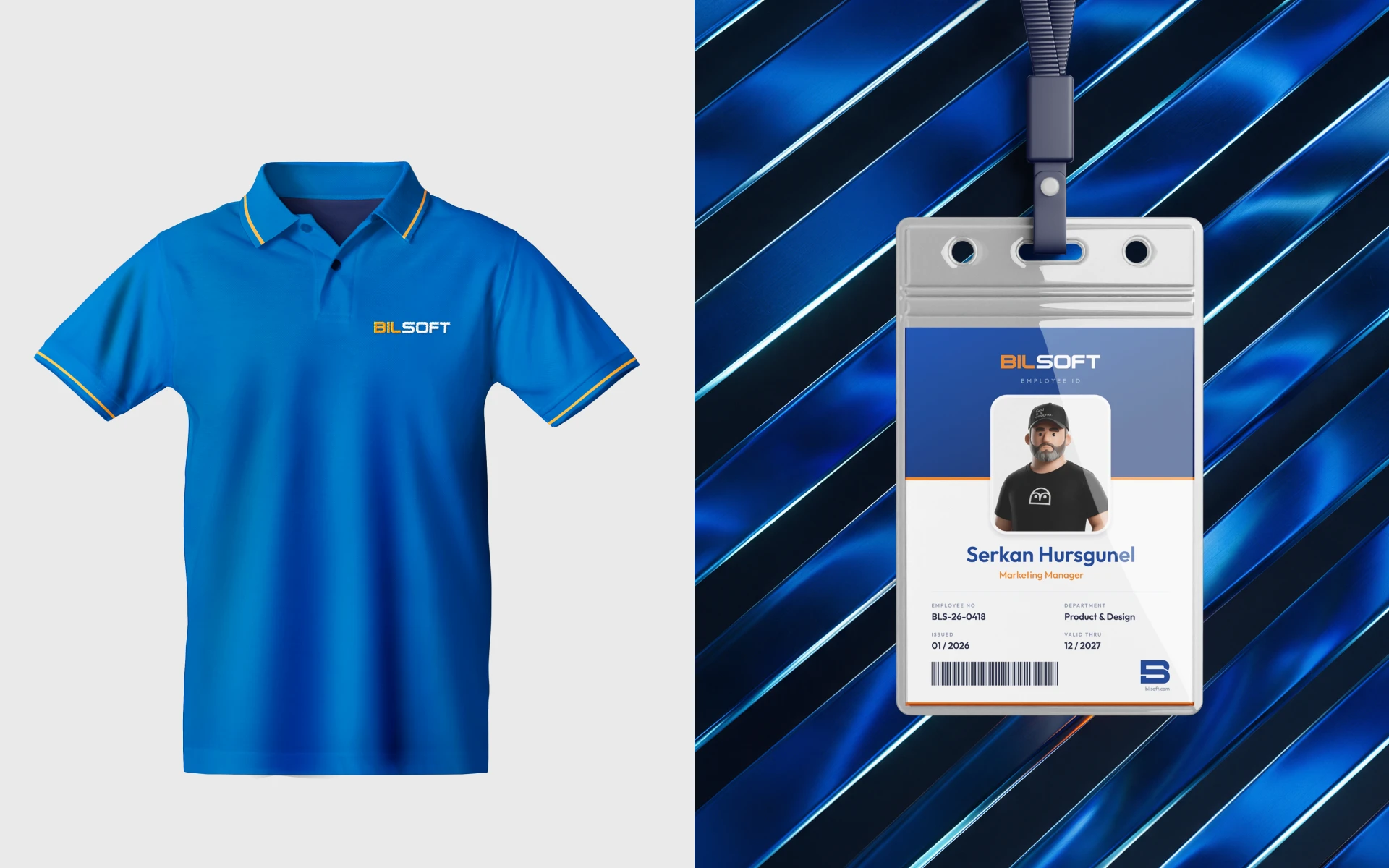
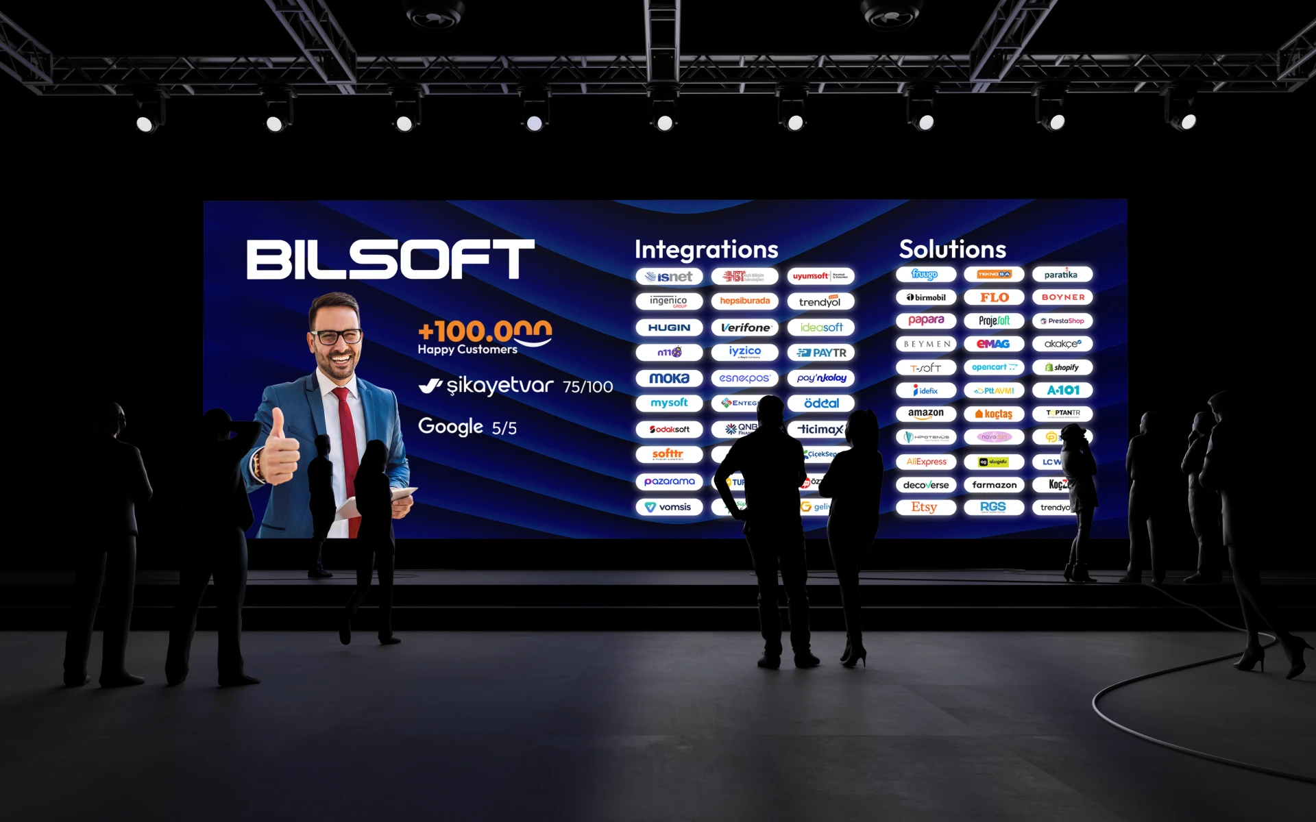
Bilsoft had a reputation it had earned over two decades, but its brand didn’t show it. Every touchpoint had grown on its own, and the result looked more like a collection of separate companies than one established software brand. For a business asking customers to trust it with their invoices and accounts, that inconsistency quietly worked against them. The real question wasn’t how to make Bilsoft look modern. It was how to make it look as trustworthy as it already was. Accounting software sits in an uncomfortable spot: it has to feel precise and serious, yet the people using it are small business owners who just want things to be simple. The identity had to hold both at once. That tension shaped every decision. The wordmark was redrawn on a strict geometric grid, so it carries the precision you expect from financial software. Its softened corners keep it from feeling cold or corporate. The name itself became the idea. “Bil” means knowing, and it took the warm, energetic side of the brand. “Soft” took the steady, dependable side. Read together, the logo says what Bilsoft wants customers to feel: we know this, and we’ve got you. A brand like this only works if the team can keep it consistent without a designer in the room. So rather than handing over a logo file, I wrote the system down as a practical guideline. It is built for the people who actually produce Bilsoft’s materials every week: marketing, partners and developers. The last step was proving it holds up. I applied the identity everywhere a customer or employee meets Bilsoft, from the app on a phone to a badge on someone’s chest to a stage screen in front of a crowd. I finished with a motion piece that builds the wordmark letter by letter. After years of a brand that grew piece by piece, Bilsoft now shows up as one company, everywhere.
Bilsoft had a reputation it had earned over two decades, but its brand didn’t show it. Every touchpoint had grown on its own, and the result looked more like a collection of separate companies than one established software brand. For a business asking customers to trust it with their invoices and accounts, that inconsistency quietly worked against them. The real question wasn’t how to make Bilsoft look modern. It was how to make it look as trustworthy as it already was. Accounting software sits in an uncomfortable spot: it has to feel precise and serious, yet the people using it are small business owners who just want things to be simple. The identity had to hold both at once. That tension shaped every decision. The wordmark was redrawn on a strict geometric grid, so it carries the precision you expect from financial software. Its softened corners keep it from feeling cold or corporate. The name itself became the idea. “Bil” means knowing, and it took the warm, energetic side of the brand. “Soft” took the steady, dependable side. Read together, the logo says what Bilsoft wants customers to feel: we know this, and we’ve got you. A brand like this only works if the team can keep it consistent without a designer in the room. So rather than handing over a logo file, I wrote the system down as a practical guideline. It is built for the people who actually produce Bilsoft’s materials every week: marketing, partners and developers. The last step was proving it holds up. I applied the identity everywhere a customer or employee meets Bilsoft, from the app on a phone to a badge on someone’s chest to a stage screen in front of a crowd. I finished with a motion piece that builds the wordmark letter by letter. After years of a brand that grew piece by piece, Bilsoft now shows up as one company, everywhere.
Client
Client
Bilsoft Yazılım
Bilsoft Yazılım
Industry
Industry
Accounting & Business Software
Accounting & Business Software
Duration
Duration
1 Month
1 Month
Year
Year
2025
2025



Branding
Let’s
Talk
Ready to transform your vision into reality? Let's discuss how powerful design can elevate your project. Click here to start our collaboration and make magic happen together!

1 Spot Available
Let’s
Talk
Ready to transform your vision into reality? Let's discuss how powerful design can elevate your project. Click here to start our collaboration and make magic happen together!
1 Spot Available
Let’s
Talk
Ready to transform your vision into reality? Let's discuss how powerful design can elevate your project. Click here to start our collaboration and make magic happen together!
1 Spot Available
Let’s
Talk
Ready to transform your vision into reality? Let's discuss how powerful design can elevate your project. Click here to start our collaboration and make magic happen together!
1 Spot Available
Let’s
Talk
Ready to transform your vision into reality? Let's discuss how powerful design can elevate your project. Click here to start our collaboration and make magic happen together!
1 Spot Available